I ask claude for some other suggestions for things to add here, and
I agree with 2 of them:

- Remove a white flash by setting a default collor of the window as
  black.
- Explicitly set the maximized state.
# Summary
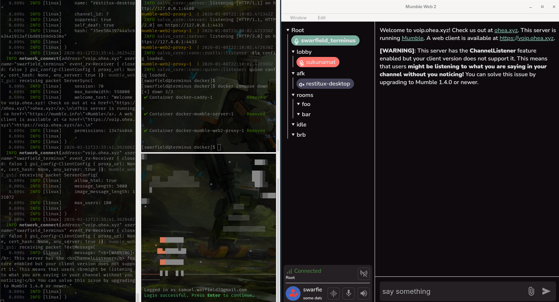
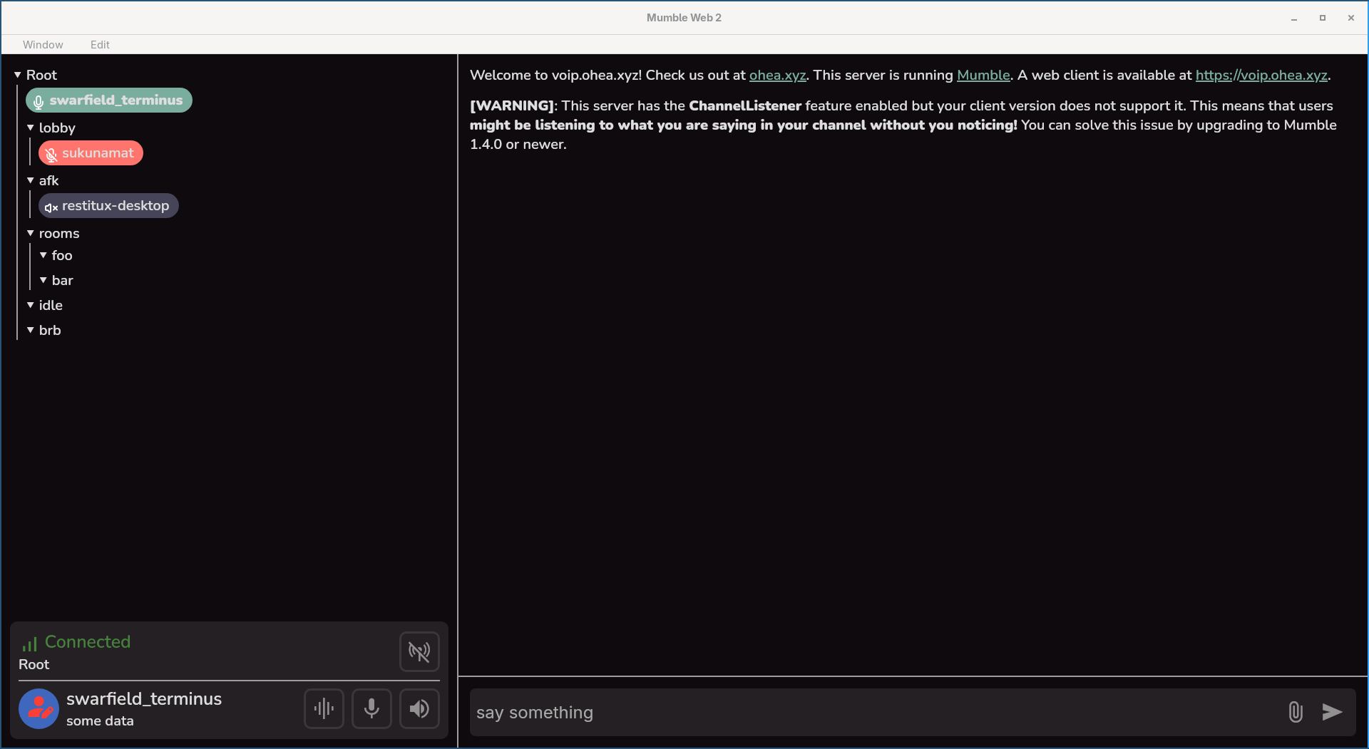
This change improves the channel selection behavior to be more similar to the official client and generally more usable. It's currently mildly broken due to the details element grabbing click events from the whole row and the row text being selectable. This change also makes it more obvious that the channel title can be clicked. I'm not sure how this works on mobile, so we might need to make more changes there in the future to work better with touchscreens.
# Changes
- Channels can only be expanded or collapsed by clicking on the adjacent arrow
- Expand/collapse arrows are only displayed on channels with children or users
- Channel can only be joined by double clicking to the right of the collapse/expand arrow
- The channel title background (and the empty space to the right) display a highlight when the user hovers over them.
- All text inside the channel view is no longer selectable.
# Testing
I tested on the desktop client. I didn't test on mobile but I'll give it a shot after I merge and maybe come back with another PR to make this behavior more intuitive over there.
Reviewed-on: #21
I vibe coded a change so that I can use mumble-web2 when I only have it in a small area instead of a full screen.
Scaling for smol screens:
Full screen scaling:
Reviewed-on: #15
Reviewed-by: restitux <restitux@ohea.xyz>
Co-authored-by: Samuel Warfield <samuel.warfield2@gmail.com>
Co-committed-by: Samuel Warfield <samuel.warfield2@gmail.com>
Remove public_url config option
Use proxy_url instead for example configs
Get status from relative endpoint, like /config
Show version on login page

Reviewed-on: #5
Co-authored-by: Sam Sartor <me@samsartor.com>
Co-committed-by: Sam Sartor <me@samsartor.com>